Our team lead Guillermo has had quite a bit of hiring to do, and you can read more about his journey in this article here. Obviously, such a change requires new ways of working together, like figuring out how to coordinate projects and communicate effectively. We also tested and organized new ways to conduct meetings, and now NASA has a daily standup, bi-weekly feedback sessions, and monthly team retros, just for us.
In one of those retros, we came across an interesting question: What, actually, are our team values? What are the principles that guide how we work together, and how we make individual design decisions? How can we make sure that we’re all aligned on the same priorities and standards? Thus, NASA embarked on a new quest: To come up with general principles for our team that support our work and help guide our decisions. It was important for us to distinguish between design principles and design team principles: This quest was about the latter, as we wanted clear ground rules for our work as designers in Team NASA, and not design principles like “The corner radius is always 4 px” (we already have those, and like any good designers, we break them regularly).
The Process
After posing these questions, we started our quest by thinking long and hard about what’s important to us in this context (both as individuals and as a team). We then gathered our ideas and clustered similar thoughts. This process itself already fostered team spirit, as it required us to examine our work habits and priorities together. Afterwards, we had about seven or eight topics, which we then discussed and narrowed down to our most important five. For each of those ideas, one of us was responsible for coming up with a good headline and short description of what that principle is about. Another round of discussion resolved any disagreements about phrasing and word choice, and, ta-da!, we had our five design team principles. And obviously, we couldn’t just let them sit in a document somewhere, but had to make some nice posters out of them – we are designers, after all.
Summed up in one paragraph, this process sounds easy-peasy now, but the hardest step was in fact the first one: To sit down and question our daily work patterns, and to get to the underlying ideas that we operate on, is quite an exercise in introspection. Additionally, our principles had to be future-proof as well as actionable. This means that they needed to be general enough so they don’t become easily obsolete should our team structure or requirements change, but also specific enough to actually help us on a day-to-day basis. Personally, I believe we managed this quite well and came up with a strong foundation to continue building NASA’s (metaphorical) rockets on. But see for yourself – here are our final five design team principles (in no particular order, and with some additional thoughts for the purpose of this article).
#1 Design for trust

To build user trust and to enable confident actions, information needs to be displayed clearly and intuitively. We use transparent communication and familiar patterns to provide useful data and appropriate guidance.
As we’re working in the fintech area (finances and insurance can be quite sensitive topics), user trust is an essential consideration for any product aspect we design. But this also applies to things we do for internal use. For example, our comprehensive slidedeck templates, as our colleagues also need to be able to easily use and understand our work.
#2 Design together

We encourage open dialogue and collaboration among designers, developers, product owners and stakeholders. We aim to create a positive working environment where ideas and concepts can be shared freely.
Anyone working in a multidisciplinary team – or just in a team in general, for that matter – should know how crucial open communication is to ensure successful projects and products. But viesure is an especially interesting melting pot of job roles, expertise and responsibilities, considering we’re the young tech start-up of one of Austria’s biggest and most traditional insurance companies. Thus, working together well can be quite a challenge, but very rewarding as well.
#3 Design for all

We strive to design experiences that are inclusive and meaningful for individuals of all abilities, cultures and backgrounds. Considering accessibility throughout the creative process will ensure a full and dignified participation for all of our users.
Again, let me emphasize why these principles should be ground rules for all our tasks: Accessibility does not only apply to users of an app we may design, but also to internal design work that concerns coworkers and colleagues (this could mean, for example, to not write documentation or instructions for a multi-national team in German).
#4 Design driven by data

Our designs are built on a foundation of data and empathy. Supported by user research, our decisions reflect a deep understanding of our users’ needs, challenges and objectives.
We as designers tend to rely on our growing experience and intuition a lot – but this is just a gentle reminder that sometimes, your gut feeling is just not enough. On the other hand, not everything can be represented by data and numbers, so it’s essential to empathize with the humans you’re designing for, and understand their goals and problems.
#5 Design hunger
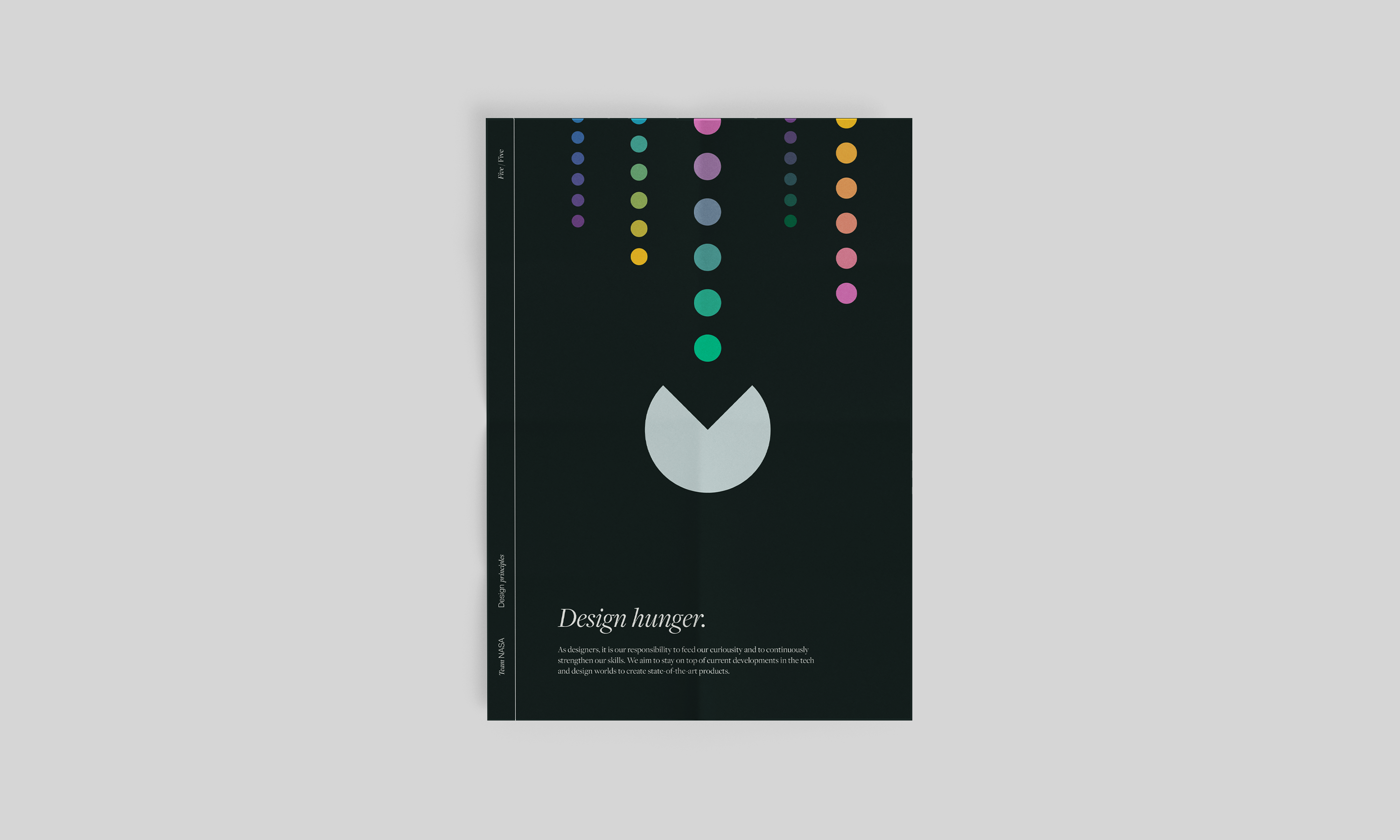
As designers, it is our responsibility to feed our curiosity and to continuously strengthen our skills. We aim to stay on top of current developments in the tech and design worlds to create state-of-the-art products.
“I’ve learned enough and I’m now perfect at my job” – said no designer ever: The desire to explore new things and an intrinsic inquisitiveness are basically prerequisites for the job. However, it’s still good to emphasize that keeping up with current trends and news, as well as continuously pushing the boundaries of what we’re able to do, are important foundations of ensuring useful and enjoyable experiences and designs.
Where to next?
Well, now our quest is done, and the next step is to get our principle posters printed and framed, and to hang them up somewhere prominent in the office, so everyone can admire them. Maybe we should even collect an entrance fee for this wonderful exhibition? Jokes aside, of course the work isn’t finished – just because we wrote our team principles down, doesn’t mean we’re actually perfect in following them. I do want to underline that there’s always room for improvement and we have quite a few things to learn and work on as a team. One topic that recently came up, for example, is aiming to show UX concepts to teammates and stakeholders way earlier (rather than at a later, pixel-perfect design stage), corresponding to Principle #2, Design together.
Who knows, we might even revise these principles in a year and add something new – collaboration is an ongoing journey, after all. Whatever happens, though, the whole process of examining our (design) work, priorities and habits was a wonderful team exercise and an interesting voyage into the heart of Team NASA. Let’s keep pushing and see where our next quest will lead us! 🚀 🪐